|
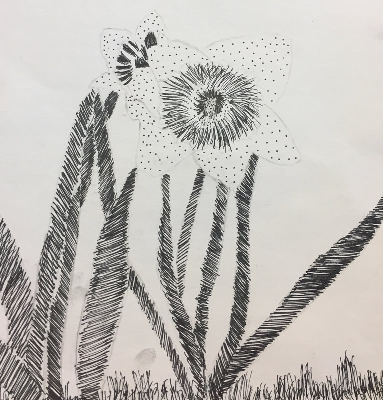
1/9/2018 0 Comments Art 1 Final ExamThe art criticism process consists of many steps. Once step is to describe the artwork by listing what you see in the artwork. For example you can look for images, art elements, color schemes, or characteristics that you could describe over the phone. Step two is analyzing the artwork. Someone can analyze artwork by listing elements and design principles such as color, value, line, shape/form, texture, space, Balance, Emphasis, Harmony, Variety, Movement/Rhythm, and Proportion. The next step is to interpret the artwork. When interpreting the artwork someone could ask themselves what the mood the is or what feelings are being communicated. Some other questions to ask yourself are what ideas are being represented and what is the story. The last step is judge the artwork. Someone would judge artwork by stating what they think of the artwork and why they think it is successful or unsuccessful using descriptions and evidence. 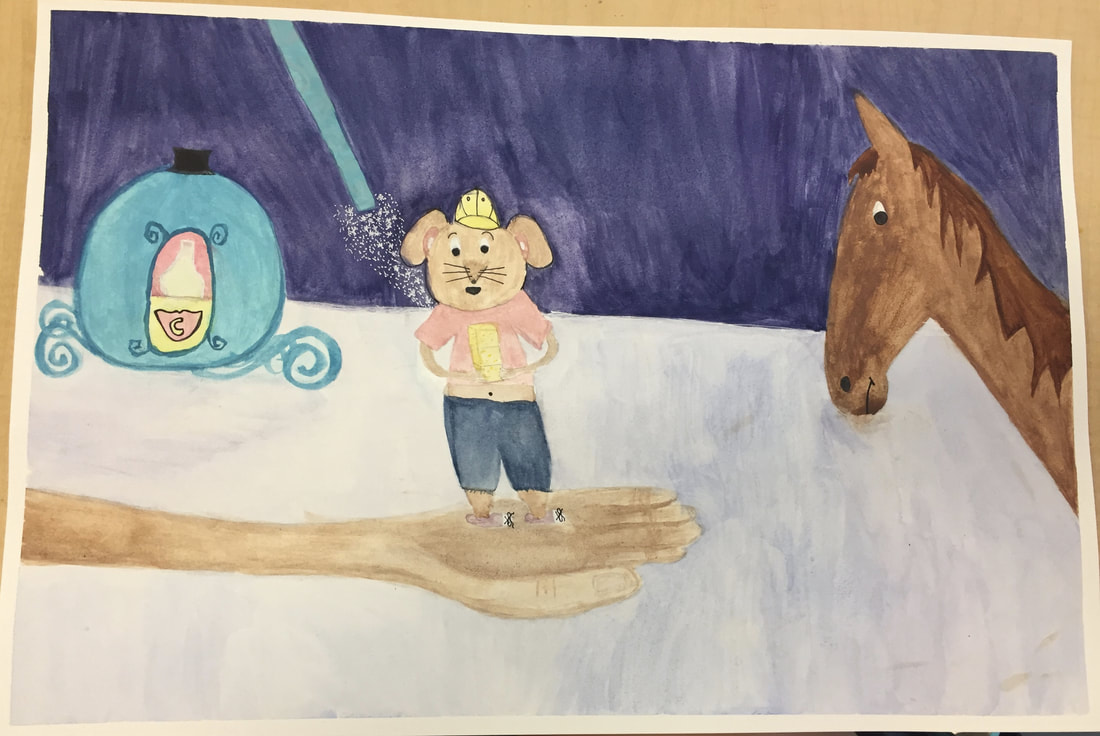 Artwork Critique In this artwork I see the images of Cinderella's Magic Carriage, a magic wand, a hand holding Gus the mouse, and a horse. I also see a background with dark purple tones to it, which makes it look like night time. I would describe this piece over the phone by explaining that that artwork is a watercolor painting and that it is another take on the scene where the Fairy Godmother is using her magic wand to make Cinderella's night magical. I see the elements of line in the carriage, arm, and hand, shape in the animal features, texture in the hands fingers, and theme overall is magical. The color schemes of this are very cold toned colors with a little mix of warm tone colors. The background and carriage use blues and purples. The arm, mouse, and horse use a bit warmer colors. I did try to also mix the two by adding a bit of warmer pinks and yellows to the carriage. The watercolor painting uses the elements of color, line, shape/form, and texture. Also Emphasis and Proportion are used throughout the painting. Warm and cool colors are used to make the watercolor painting look more realistic. Line is represented by the carriage and the swirly lines used to show the wheel. Line is also shown throughout the horses mane and the arm. Shape and form are the elements that help make the mouse and horse look more realistic, for example, the eyes, noses, and ears. Texture is in the hand and the way the fingers show wrinkles of the skin. The emphasis of the painting is Gus the mouse and how the magic wand is changing him into a horse to pull the carriage. The Proportion of the mouse is supposed to be smaller than the horse, but he appears larger because he is being help closer. The proportion of the carriage to the mouse and horse is a lot smaller because it is farther away. The horse is between the mouse and carriage. The mood of the artwork is happy and surprising because Gus has a surprised look on his face because the magic wand is being used on him to help Cinderella. The feeling being communicated by the piece is excitement and suspense because the magic is coming out of the magic wand, but the viewer does not know what is going to happen to Gus. The idea is that Gus is very surprised to be picked up and pointed at with a wand because he was trying to enjoy his cheese and just watch Cinderella's Fairy Godmother put he magic wand to work. Gus did not realize he was going to apart of this situation too. That story is that Gus is about to be turned it a horse from Cinderella's Fairy Godmothers wand and his freaking out about it because she totally caught him off guard. I think the artwork is good. It is successful and unsuccessful in different ways. I think all of the colors were mixed nicely, but i think they could have been spread out better, for example, the background looks a bit uneven in some areas. Also the colors that were different and next to each other kind of bleed into the edges. I think the carriage turned out nicely and I like how the wheels swirl. I also love the addition of the fairy dust coming from the magic wand using the white gel pen because it brings the whole painting together. The mouse and horses eyes look realistic as well. I learned so much from this project and painting with watercolor. I would love to try a mother watercolor piece and try to improve my skills putting the colors next to each other and even colors spread.   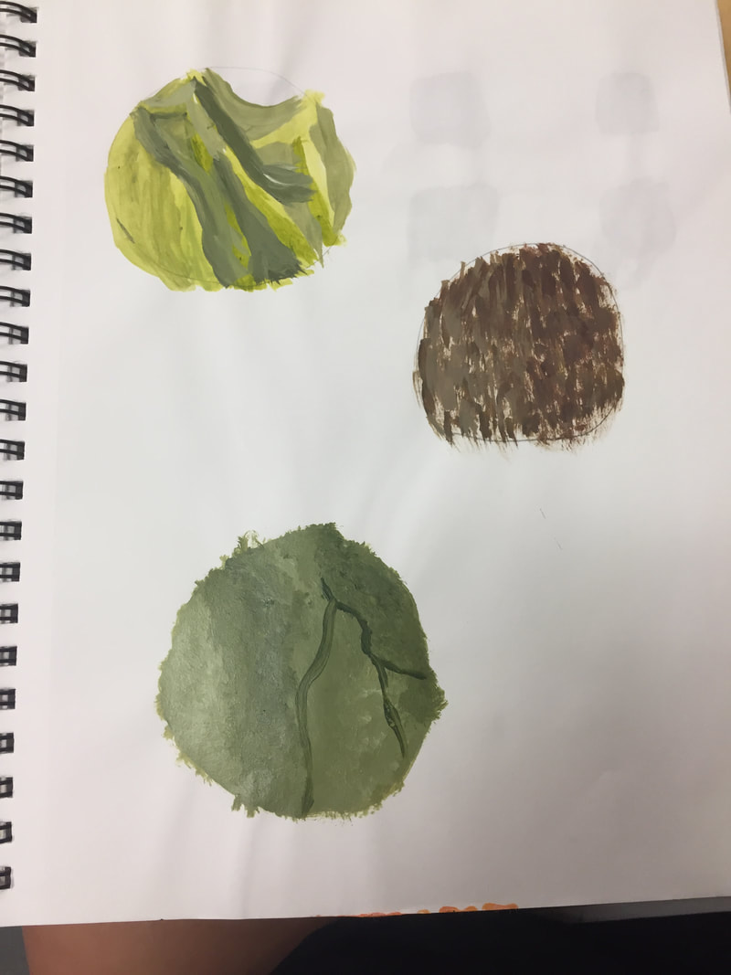 What is art?
Art is a form of expression through the use of anything. I think art is something that comes from the mind, body, and soul. I believe art is something that can be created through the work of paint, pencils, the list is unlimited, but I also think art can be shown through movement. Art is an idea or feeling that is created to inspire, astonish, and bring emotion to the artists themselves and the viewer. What are some reason why artists make art? Artists make art to express themselves and what they are feeling. The creation of art can also be to make a point or spread the word of something the artist believes or does not believe in. Art is also formed to maybe make someone feel better. For example, art therapy is a reason an artists might make art. People make art to give others a feeling of happiness if they are interested in the, for example, painting. People also make art for a source of income. Medium: Which medium did you most enjoy working with and why? Which medium did you not use, but wish you had explored? Include photo. I enjoyed working with acrylic paint the most. I found it very relaxing and I liked how if you messed up you could fix it by just painting over the other paint after it dried. Acrylic paint also looked so nice and clean and you could create so many colors. I did not use colored child, but I wish I wish I did because it looks very cool. I want to try chalk because it would be fun to step out of my comfort zone and create something where I can put together different colors to make other colors and make things look realistic!!!!!
0 Comments
Leave a Reply. |
Paige Smith's Website
http://acommonname.com/street-art-project/ Intro to drawing 1
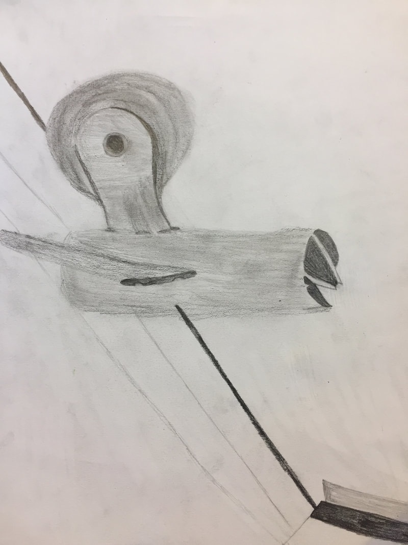
Charcoal Drawing
The pros of charcoal drawing are that the charcoal is fun and easier to blend than other materials and it gives the drawing a little bit of a texture, which I really like. The darkness of the charcoal, when you press it down hard on the paper, gives a nice demension to object and makes it look 3-D. The cons of charcoal drawing are that it is so messy and gets everywhere and it is hard to fix a mistake once you make it. When you press the charcoal down too hard it makes it really hard to make it lighter after that. 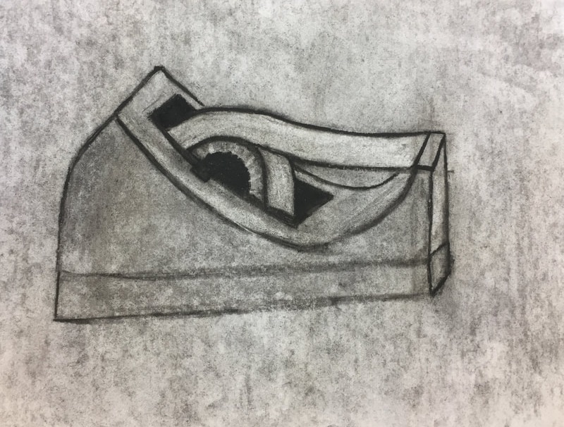
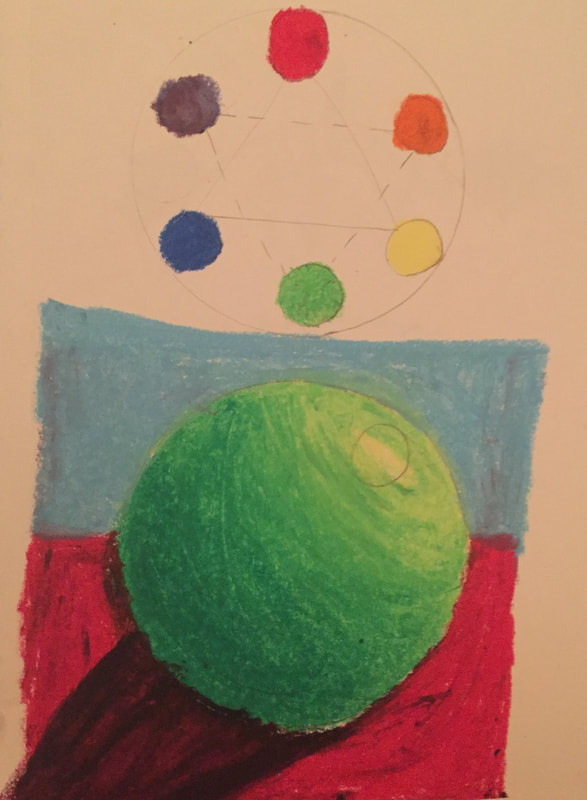
Warm Up:
The warm up that I think helped me the most was the pastel sphere. This is because it taught me how to add shadows and light spots based from the light is shining on to the object.
Composition: The nature of somethings ingredients. The way in which a whole is made up. Value: The lightness or darkness of tones or colors. Meet Your Mentor
My mentor is Shaley Khoury. She is a senior at Apex High School and is taking Art 4 right now. She loves the medium photography and she also likes to draw buildings in the sky. Her digital portfolio link is Shaelyn-apex-2018.weebly.com. I think I can benefit a lot by this because she gave me such amazing advice about how improve my art. Also having someone who has already taken the class give me advice helps by making me feel like at some point my art could be just as awesome as hers if I really work hard and have fun with it. I want to learn different techniques in art and how I can use those techniques in my pieces. Learning Color/Paint Mixing
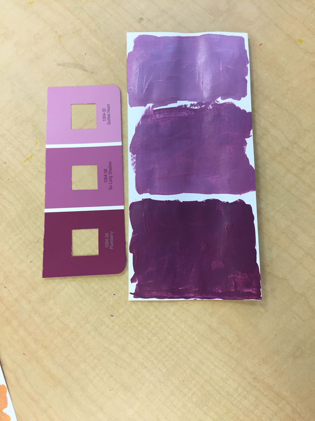
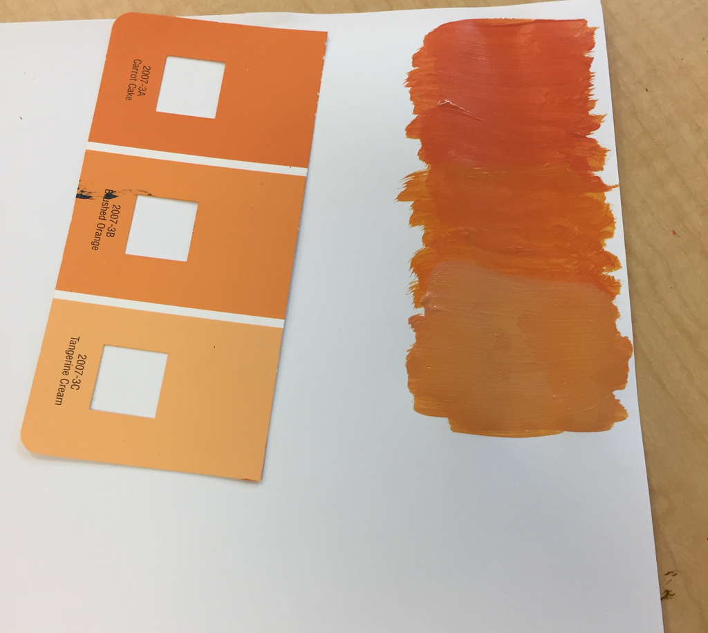
I learned how to mix paint colors to form different tints and shades of color. I also learned what colors are mixed to get to another color, for example, yellow, red, and white make orange! 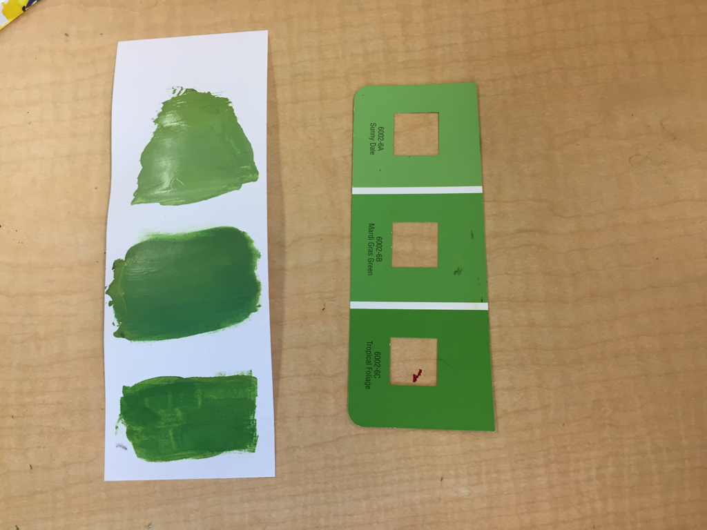
Brown Swatches
Brown is made by mixing Orange and Blue, Green and Red, and Purple and Yellow. Brown can be made lighter or darker by adding white or black. 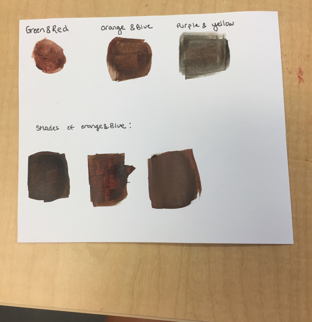
|
 RSS Feed
